Design Lesson - iPhone Alarm Clock
Posted on February 14th, 2019
I was going through Basecamp’s new blog - Signal vs. Noise when I came across this post about the design interface of the iPhone alarm that destroys my peace of mind every morning.
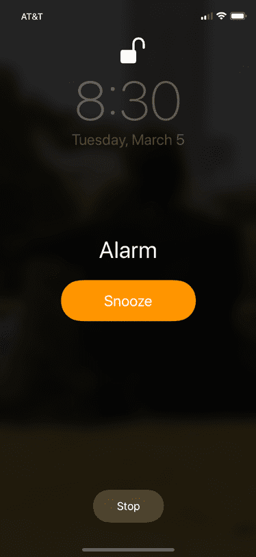
The post talks about the placement of both Snooze & Stop button on the alarm clock and Stop & Repeat button in the iPhone timer.
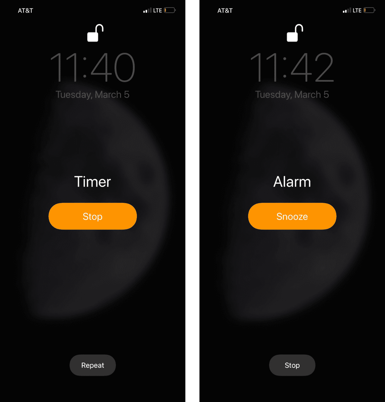
It points out well that in case of Timer the ‘Stop’ button is up top and in case of Alarm the ‘Stop’ button is down below shown in a less prominent manner - which can no doubt be confusing for someone who uses both Timer and Alarm clock regularly.
But here you have to stop and think in terms of utility. Imagine if Stop button was more prominent. You don’t want to accidentally tap the Stop button in your sleep when you want to sleep for 5 more minutes, do you?
It’s a simple design but it shows how well Apple has thought about users’ mindset when they wake up to an alarm clock early in the morning.
The Stop button is also less prominent because it makes sure that the user has to put in a little more cognitive effort to press the Stop button compared to the Snooze button.
So maybe if the user is putting that extra cognitive load to press the ‘Stop’ button instead of ‘Snooze’ button then they might actually be awake.
Like I said, it’s a simple design but it’s designed towards achieving the end goal - ensuring that you wake up.
About the author

Based in India. Building a few helpful things. Find me here talking about anything and everything. Keeping a track of my ideas so they don't get lost in the void. Tweet at me if you need me.